> ## Documentation Index
> Fetch the complete documentation index at: https://razorpay-881012b3.mintlify.site/llms.txt
> Use this file to discover all available pages before exploring further.
# Customisation Options
> Customise the Affordability Widget on your Shopify store.
Available in
🇮🇳 India
After successfully integrating Affordability Widget on your Shopify store, you can choose to customise the widget based on your requirement.
**Watch Out!**
Customisations on the widget are not applicable for Payments Checkout.
To customise the widget:
1. Log in to the [Shopify Store](https://accounts.shopify.com/store-login) and navigate to **Apps** → **Razorpay Affordability Widget**.
2. Select **Customisation Options**.
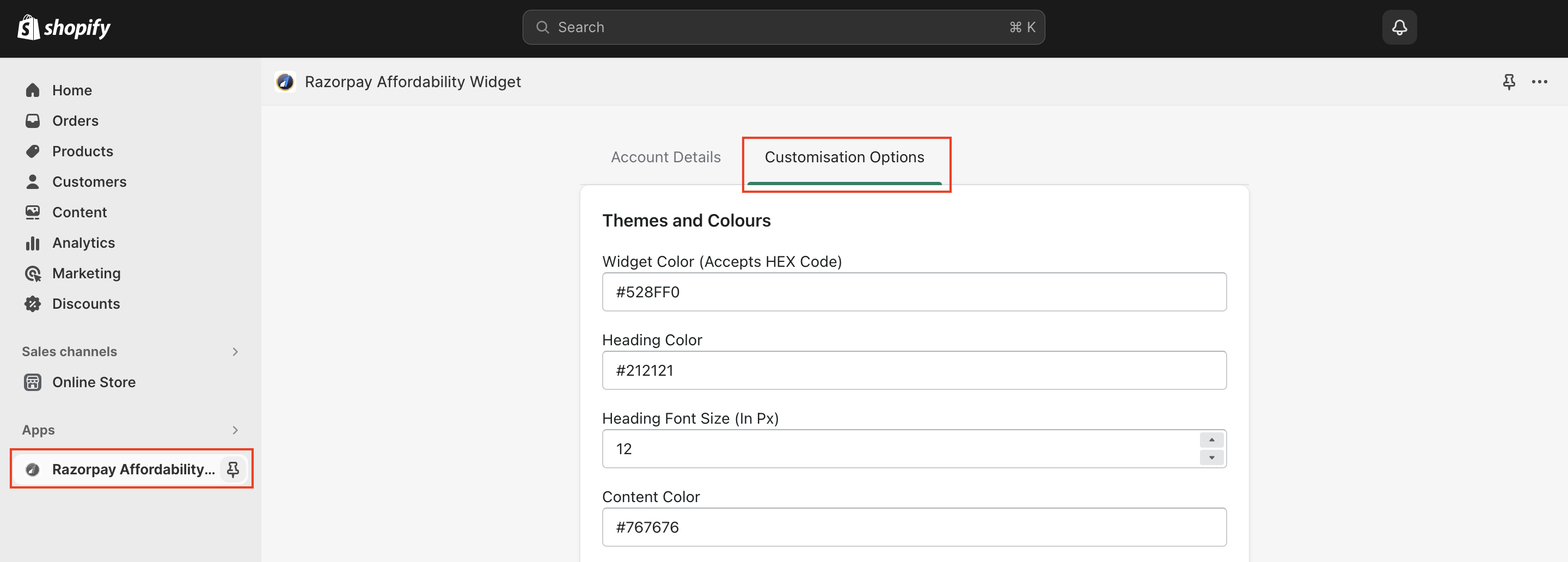 You can now customise the following options:
1. [Themes and Colours](#1-themes-and-colours)
* Widget Color
* Heading Color
* Heading Font Size
* Content Color
* Content Background Color
* Content Font size
* Link Color
* Link Font Size
* Discount Color
* Footer Color
* Footer Font Size
* Razorpay Dark Logo
* Enable Button Link
* Widget Dark Mode
2. [Payment Methods](#2-payment-methods)
* Card EMI
* Cardless EMI
* Pay Later
* Card EMI Providers
* Cardless EMI Providers
* Pay Later Providers
3. [Offers](#3-offers)
* Offers
* Limit Offers
* Hide Offer Amount
* Show hidden Offers
**Watch Out!**
Once you customise the widget, click **Save** at the end of the customisation page for the changes to reflect.
## 1. Themes and Colours
Alter the appearance of the widget based on your store. The following customisation options are available:
You can now customise the following options:
1. [Themes and Colours](#1-themes-and-colours)
* Widget Color
* Heading Color
* Heading Font Size
* Content Color
* Content Background Color
* Content Font size
* Link Color
* Link Font Size
* Discount Color
* Footer Color
* Footer Font Size
* Razorpay Dark Logo
* Enable Button Link
* Widget Dark Mode
2. [Payment Methods](#2-payment-methods)
* Card EMI
* Cardless EMI
* Pay Later
* Card EMI Providers
* Cardless EMI Providers
* Pay Later Providers
3. [Offers](#3-offers)
* Offers
* Limit Offers
* Hide Offer Amount
* Show hidden Offers
**Watch Out!**
Once you customise the widget, click **Save** at the end of the customisation page for the changes to reflect.
## 1. Themes and Colours
Alter the appearance of the widget based on your store. The following customisation options are available:
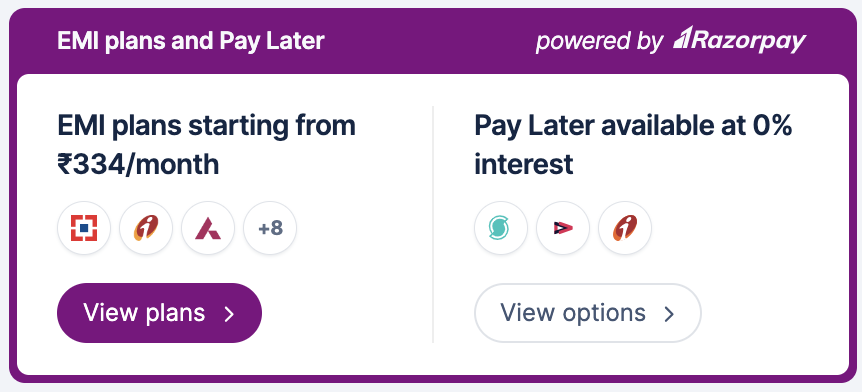
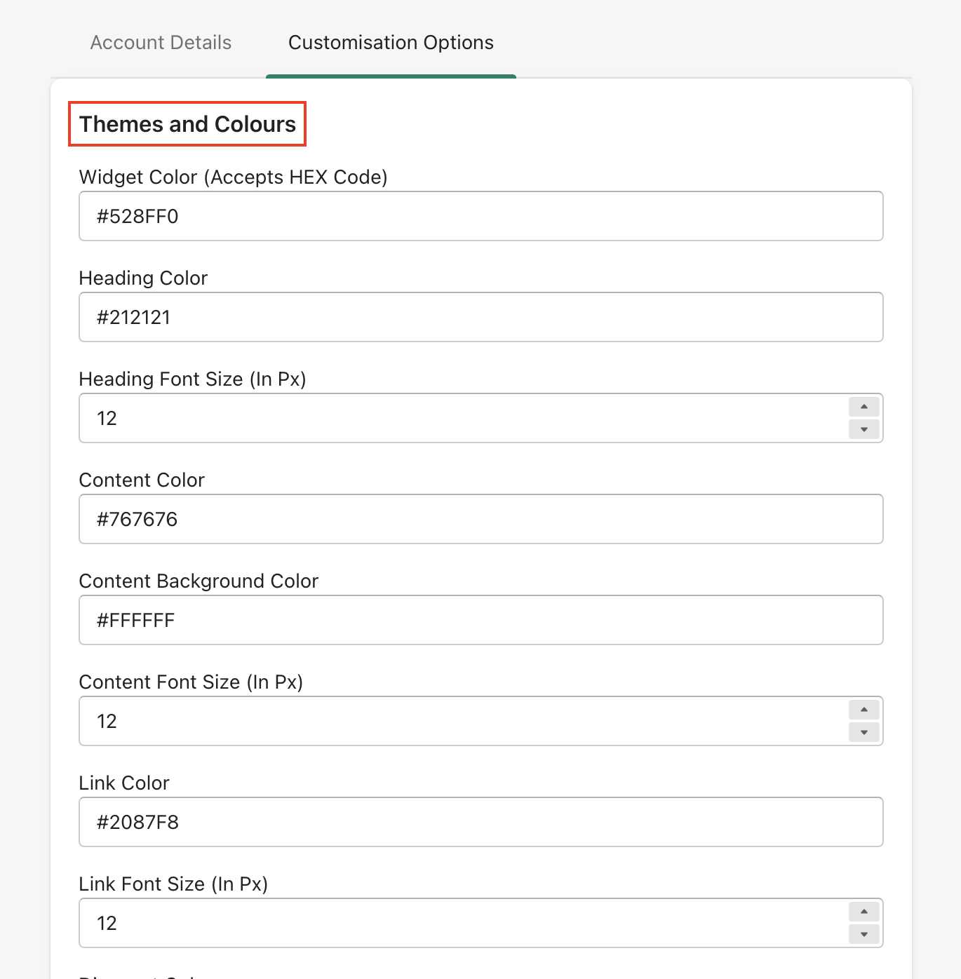 * **Widget Color**: Customise the widget theme colour based on your requirement. For example, if the background colour of the header is blue, you can change the colour to purple.
**Handy Tips**
* The default theme colour (blue) set on the widget will be considered if no colour is passed here.
* **Widget Color**: Customise the widget theme colour based on your requirement. For example, if the background colour of the header is blue, you can change the colour to purple.
**Handy Tips**
* The default theme colour (blue) set on the widget will be considered if no colour is passed here.
* Only a 6-character HEX code is supported.
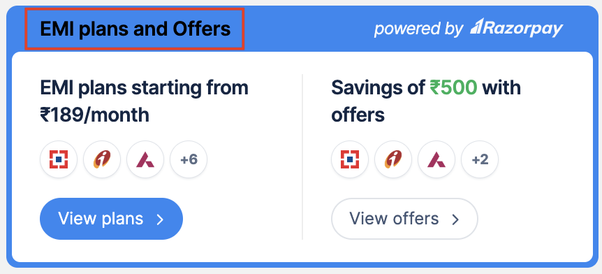
 * **Heading Color**: Enter the 6-character HEX code of the heading colour based on your requirement. For example, if the default colour of the header is white, you can change the colour to black.
**Watch Out!**
Enter the font size as per pixels (px). You only have to enter the required size. For example, 14.
* **Heading Font Size**: Enter the font size of the heading based on your requirement. The default size is 12.
* **Heading Color**: Enter the 6-character HEX code of the heading colour based on your requirement. For example, if the default colour of the header is white, you can change the colour to black.
**Watch Out!**
Enter the font size as per pixels (px). You only have to enter the required size. For example, 14.
* **Heading Font Size**: Enter the font size of the heading based on your requirement. The default size is 12.
 * **Content Color**: Enter the 6-character HEX code of the content colour based on your requirement. For example, if the default colour of the content is black, you can change the colour to dark blue.
* **Content Background Color**: Enter the 6-character HEX code to customise the background colour to match the look and feel of your website. For example, if the default colour of the background is white, you can change the colour to blue.
* **Content Font Size**: Enter the font size of the content based on your requirement. The default size is 14.
* **Content Color**: Enter the 6-character HEX code of the content colour based on your requirement. For example, if the default colour of the content is black, you can change the colour to dark blue.
* **Content Background Color**: Enter the 6-character HEX code to customise the background colour to match the look and feel of your website. For example, if the default colour of the background is white, you can change the colour to blue.
* **Content Font Size**: Enter the font size of the content based on your requirement. The default size is 14.
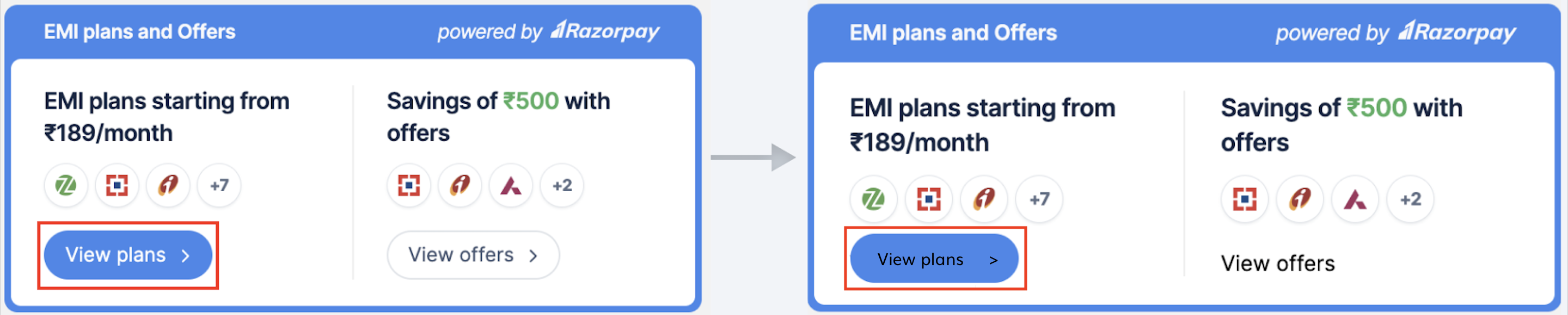
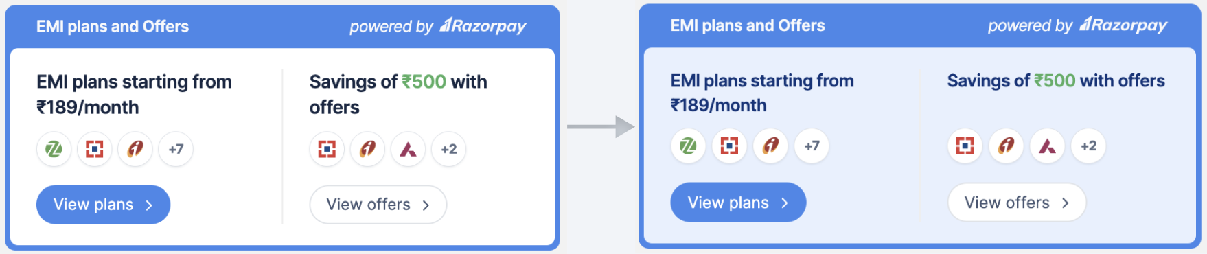 * **Link Color**: Enter the 6-character HEX code of the link colour based on your requirement. For example, if the colour of the link is blue, you can change the colour to black.
* **Link Font Size**: Enter the font size of the link based on your requirement. For example, if the font size is 10px, you can change the font size to 12px.
**Handy Tips**
The link customisations work only when button link is disabled.
* **Link Color**: Enter the 6-character HEX code of the link colour based on your requirement. For example, if the colour of the link is blue, you can change the colour to black.
* **Link Font Size**: Enter the font size of the link based on your requirement. For example, if the font size is 10px, you can change the font size to 12px.
**Handy Tips**
The link customisations work only when button link is disabled.
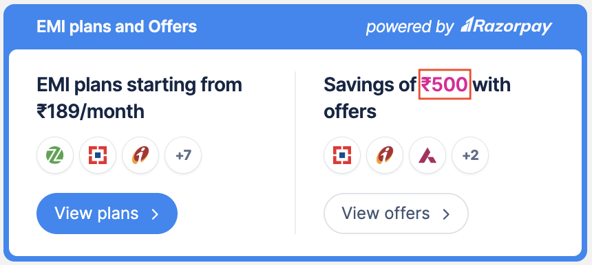
 * **Discount Color**: Enter the 6-character HEX code of the discount value colour based on your requirement. For example, if the colour of the value is green, you can change the colour to pink.
 * **Footer Color**: Enter the 6-character HEX code of the footer colour based on your requirement. The default colour is white.
* **Footer Font Size**: Enter the font size of the footer based on your requirement. The default size is 12.
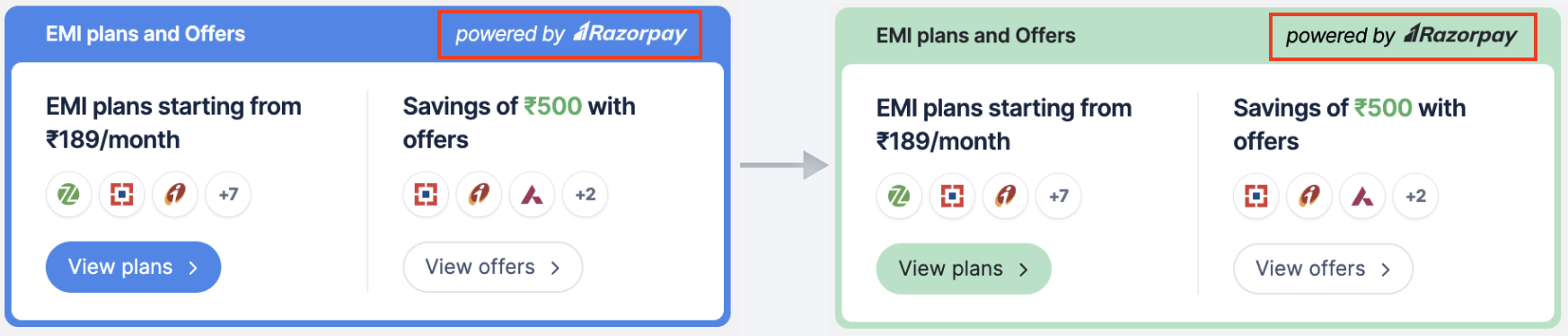
* **Razorpay Dark Logo**: Razorpay provides customisation option for the logo in two variants:
* Light (default): Display the default Razorpay logo on the widget with a darker theme colour.
* Dark: Display the Razorpay logo in a darker tone on the widget with a lighter theme colour. If you want to display the light variant of the logo, click **Activate**.
* **Footer Color**: Enter the 6-character HEX code of the footer colour based on your requirement. The default colour is white.
* **Footer Font Size**: Enter the font size of the footer based on your requirement. The default size is 12.
* **Razorpay Dark Logo**: Razorpay provides customisation option for the logo in two variants:
* Light (default): Display the default Razorpay logo on the widget with a darker theme colour.
* Dark: Display the Razorpay logo in a darker tone on the widget with a lighter theme colour. If you want to display the light variant of the logo, click **Activate**.
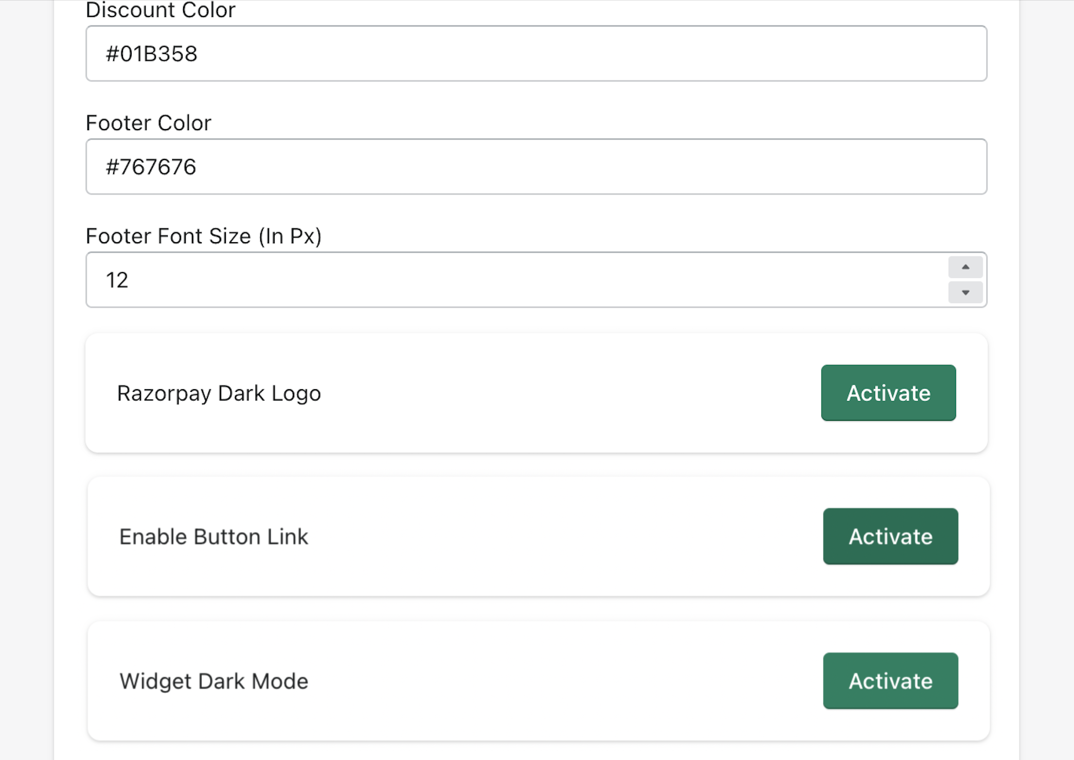
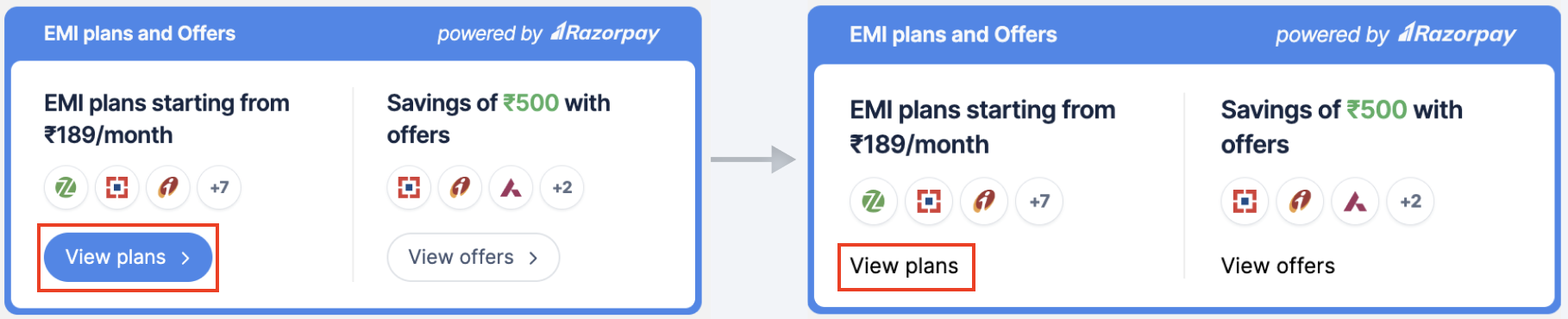
 * **Enable Button Link**: By default, a button appears on the widget to view the plans, offers and options. Click **Activate** to change the appearance of the button to a link based on your requirement.
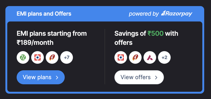
 * **Widget Dark Mode**: Enable the widget's dark mode when your website utilises dark mode. This is specifically designed for websites with darker background colors, improving the presentation of offers, plans, and options. Click **Activate**.
 ## 2. Payment Methods
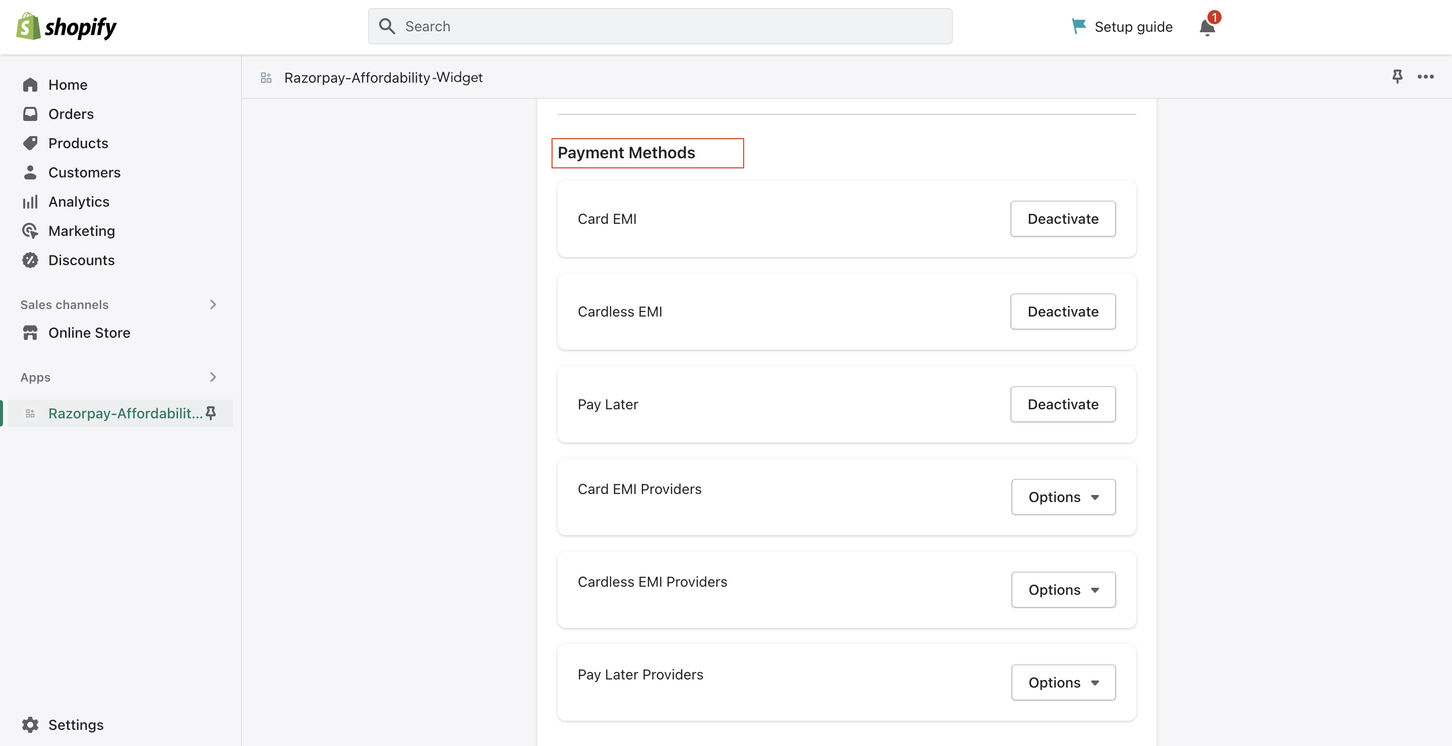
Configure the payment methods you want to display on the store based on your requirement.
## 2. Payment Methods
Configure the payment methods you want to display on the store based on your requirement.
 #### 2.1 Card EMI
EMI is enabled by default. To deactivate the EMI payment option, click **Deactivate**. The EMI options will not appear on the widget and the customers will not be able to view them.
**Handy Tips**
All EMI options applicable for the payment amount will appear on the widget by default. For example, if the payment amount is ₹3000, the widget displays only the suitable EMI options.
#### 2.2 Cardless EMI
Cardless EMI is enabled by default if it is activated for your account. To deactivate the Cardless EMI payment option, click **Deactivate**. The Cardless EMI options will not appear on the widget and the customers will not be able to view them.
**Handy Tips**
All Cardless EMI options applicable for the payment amount will appear on the widget by default. For example, if the payment amount is ₹3000, the widget displays only the suitable Cardless EMI options.
#### 2.3 Pay Later
Pay Later is enabled by default if it is activated for your account. To deactivate the Pay Later payment option, click **Deactivate**. The Pay Later options will not appear on the widget and the customers will not be able to view them.
**Handy Tips**
All Pay Later options applicable for the payment amount will appear on the widget by default. For example, if the payment amount is ₹4000, the widget displays only the suitable Pay Later options.
#### 2.4 Card EMI Providers
Razorpay supports [Debit Card](/docs/payments/payment-gateway/emi²/faqs#5-can-you-provide-a-list-of-the) and [Credit Card](/docs/payments/payment-gateway/emi²/faqs#1-what-are-the-standard-credit-card-interest) EMI providers for EMI options. By default, all EMI options satisfying the minimum transaction amount will appear on the widget. If you want to display limited EMI options on the widget, in the **Options** drop-down list, select/unselect the providers of your choice.
#### 2.5 Cardless EMI Providers
Razorpay supports [these Cardless EMI providers](/docs/payments/payment-gateway/emi²/faqs#cardless-emi). By default, all Cardless EMI options satisfying the minimum transaction amount will appear on the widget. To display limited Cardless EMI options on the widget, in the **Options** drop-down list, select/unselect the provider of your choice.
#### 2.6 Pay Later Providers
Razorpay supports [these Pay Later providers](/docs/payments/payment-gateway/emi²/faqs#2-what-are-the-standard-interest-rates-charged). By default, all Pay Later options satisfying the minimum transaction amount will appear on the widget. If you want to display limited Pay Later options on the widget, in the **Options** drop-down list, select/unselect the provider of your choice.
## 3. Offers
Configure the offers you want to display on the store based on your requirement. Customers can choose from a wide range of offers for your product or service. Know how to [create offers](/docs/payments/offers/create).
**Handy Tips**
By default, all the offers marked visible on the Dashboard during the offer creation appear on the widget.
#### 2.1 Card EMI
EMI is enabled by default. To deactivate the EMI payment option, click **Deactivate**. The EMI options will not appear on the widget and the customers will not be able to view them.
**Handy Tips**
All EMI options applicable for the payment amount will appear on the widget by default. For example, if the payment amount is ₹3000, the widget displays only the suitable EMI options.
#### 2.2 Cardless EMI
Cardless EMI is enabled by default if it is activated for your account. To deactivate the Cardless EMI payment option, click **Deactivate**. The Cardless EMI options will not appear on the widget and the customers will not be able to view them.
**Handy Tips**
All Cardless EMI options applicable for the payment amount will appear on the widget by default. For example, if the payment amount is ₹3000, the widget displays only the suitable Cardless EMI options.
#### 2.3 Pay Later
Pay Later is enabled by default if it is activated for your account. To deactivate the Pay Later payment option, click **Deactivate**. The Pay Later options will not appear on the widget and the customers will not be able to view them.
**Handy Tips**
All Pay Later options applicable for the payment amount will appear on the widget by default. For example, if the payment amount is ₹4000, the widget displays only the suitable Pay Later options.
#### 2.4 Card EMI Providers
Razorpay supports [Debit Card](/docs/payments/payment-gateway/emi²/faqs#5-can-you-provide-a-list-of-the) and [Credit Card](/docs/payments/payment-gateway/emi²/faqs#1-what-are-the-standard-credit-card-interest) EMI providers for EMI options. By default, all EMI options satisfying the minimum transaction amount will appear on the widget. If you want to display limited EMI options on the widget, in the **Options** drop-down list, select/unselect the providers of your choice.
#### 2.5 Cardless EMI Providers
Razorpay supports [these Cardless EMI providers](/docs/payments/payment-gateway/emi²/faqs#cardless-emi). By default, all Cardless EMI options satisfying the minimum transaction amount will appear on the widget. To display limited Cardless EMI options on the widget, in the **Options** drop-down list, select/unselect the provider of your choice.
#### 2.6 Pay Later Providers
Razorpay supports [these Pay Later providers](/docs/payments/payment-gateway/emi²/faqs#2-what-are-the-standard-interest-rates-charged). By default, all Pay Later options satisfying the minimum transaction amount will appear on the widget. If you want to display limited Pay Later options on the widget, in the **Options** drop-down list, select/unselect the provider of your choice.
## 3. Offers
Configure the offers you want to display on the store based on your requirement. Customers can choose from a wide range of offers for your product or service. Know how to [create offers](/docs/payments/offers/create).
**Handy Tips**
By default, all the offers marked visible on the Dashboard during the offer creation appear on the widget.
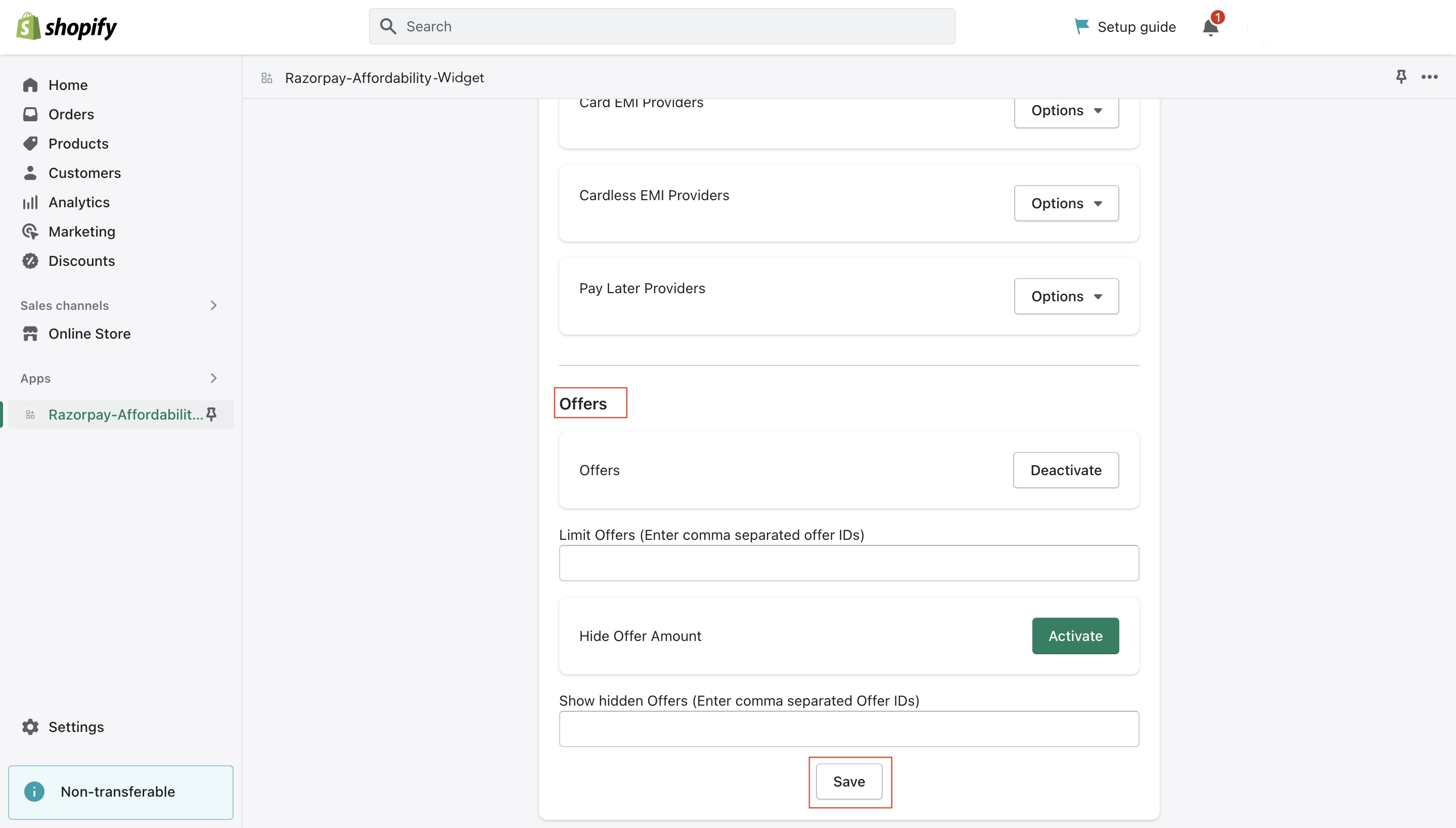 **Watch Out!**
For comma-separated lists, add the information without a space. For example, if you are adding a list of `offer_ids` then follow this format: `offer_ANZoaxsOww2X53`,`offer_LAZoazsOcc2X55`,`offer_QAFoazsOww2X78`.
#### 3.1 Offers
Offers are enabled by default. To deactivate offers, click **Deactivate**. Offers will not appear on the widget and the customers will not be able to view them.
#### 3.3 Limit Offers
To display limited offers on the widget, enter the `offer_id` of the offers of your choice.
#### 3.3 Hide Offer Amount
By default, the customers can view the exact discount amount. This helps the new customers compare and choose your products over your competitors. Click **Activate** to hide the discount amount on the widget if required.
#### 3.4 Show Hidden Offers
By default, all those offers with the **Show Offer on Checkout** option enabled during creation will appear on the widget. Additionally, you can enter the `offer_id` of the offer that did not have the [Show Offer on Checkout](/docs/payments/offers/create#offer-validity:~:text=Show%20Offer%20on%20Checkout) option enabled during offer creation.
### Related Information
* [Affordability Widget: Shopify FAQs](/docs/payments/payment-gateway/emi²/widget/faqs#shopify)
* [About Affordability Widget](/docs/payments/payment-gateway/emi²/widget)
**Watch Out!**
For comma-separated lists, add the information without a space. For example, if you are adding a list of `offer_ids` then follow this format: `offer_ANZoaxsOww2X53`,`offer_LAZoazsOcc2X55`,`offer_QAFoazsOww2X78`.
#### 3.1 Offers
Offers are enabled by default. To deactivate offers, click **Deactivate**. Offers will not appear on the widget and the customers will not be able to view them.
#### 3.3 Limit Offers
To display limited offers on the widget, enter the `offer_id` of the offers of your choice.
#### 3.3 Hide Offer Amount
By default, the customers can view the exact discount amount. This helps the new customers compare and choose your products over your competitors. Click **Activate** to hide the discount amount on the widget if required.
#### 3.4 Show Hidden Offers
By default, all those offers with the **Show Offer on Checkout** option enabled during creation will appear on the widget. Additionally, you can enter the `offer_id` of the offer that did not have the [Show Offer on Checkout](/docs/payments/offers/create#offer-validity:~:text=Show%20Offer%20on%20Checkout) option enabled during offer creation.
### Related Information
* [Affordability Widget: Shopify FAQs](/docs/payments/payment-gateway/emi²/widget/faqs#shopify)
* [About Affordability Widget](/docs/payments/payment-gateway/emi²/widget)