

Available in🇮🇳 India
After you successfully integrate the widget on your website, you can customise the following options:
- Offers.
- Add additional Offers.
- Show limited Offers.
- Disable Offers.
- Payment Methods (EMI, Cardless EMI and Pay Later).
- Configure the list of providers for various payment methods.
- Disable payment methods.
- Themes and Colours.
- Customise theme colour.
- Change heading colour and font size.
- Change content colour, font size and background colour.
- Change discount value colour.
- Change button appearance, colour and font size.
- Change footer colour, font size and logo variants.
- Enable Dark Mode.
Video Tutorial
Watch this video to learn how to customise the Affordability Widget.1. Offers
Configure the offers you want to display on the website based on your requirement. The customers can make a choice from a wide range of offers available for your product or service. Know how to create offers.Handy TipsBy default all the offers which are marked visible on the Dashboard during the offer creation will appear on the widget.
1.1 Additional Offers
By default, all those offers with the Show Offer on Checkout option enabled during creation will appear on the widget. Additionally, you can enter theoffer_id of the offer that did not have the Show Offer on Checkout option enabled during offer creation.
Add Parameter
Parameters
key mandatory
: string API Key ID generated from the Dashboard.
amount mandatory
: integer The amount to be paid by the customer in paise. For example, if the amount is ₹4000, enter 400000.
features.offers
: object Display a set of additional offers on the widget by passing the offer_id
list optional
: array Display a list of offer_id of the offers.
1.2 Limited Offers
By default, all offers which had the Show Offer on Checkout option enabled during the offer creation will appear on the widget. In case you want to display limited offers on the widget, enter theoffer_id of the offers of your choice.To show limited offers:
Add Parameter
Parameters
key mandatory
: string API Key ID generated from the Dashboard.
amount mandatory
: integer The amount to be paid by the customer in paise. For example, if the amount is ₹4000, enter 400000.
display.offers
: object Display a set of limited offers.
offerIds optional
: array Unique identifier of the offer.
1.3 Disable the Offers
If you disable the offers completely, they will not appear on the widget and the customers will not be able to view them.To completely disable the offers:
Add Parameter
Parameters
key mandatory
: string API Key ID generated from the Dashboard.
amount mandatory
: integer The amount to be paid by the customer in paise. For example, if the amount is ₹4000, enter 400000.
display
: object Display various offers on the widget.
offers optional
: boolean Indicates whether the offers should be displayed. Possible values:
true(default): Display the offers on the widget.false: Disable the offers on the widget.
2. Payment Methods
Configure the payment methods you want to display on the website based on your requirement.2.1 EMI
Handy TipsAll EMI options applicable for the payment amount will appear on the widget by default. For example, if the payment amount is ₹3000, the widget displays only the suitable EMI options.
2.1.1 Limited Providers for EMI
Razorpay supports Debit Card and Credit Card EMI providers for EMI options. By default, all EMI options satisfying the minimum transaction amount will appear on the widget. In case you want to display limited EMI options on the widget, enter the list of provider codes based on your requirement.To show a limited set of providers:
Add Parameter
Parameters
key mandatory
: string API Key ID generated from the Dashboard.
amount mandatory
: integer The amount to be paid by the customer in paise. For example, if the amount is ₹3000, enter 300000.
display.emi.issuers optional
: array<string> List of limited set of providers for EMI options.
2.1.2 Disable EMI Options
If you disable the EMI options completely, they will not appear on the widget and the customers will not be able to view them.To completely disable EMI options:
Add Parameter
Parameters
key mandatory
: string API Key ID generated from the Dashboard.
amount mandatory
: integer The amount to be paid by the customer in paise. For example, if the amount is ₹4000, enter 400000.
display
: object Display different payment method options on the widget.
emi optional
: boolean Indicates whether the EMI options should appear on the widget. Possible values:
true(default): Display the EMI options on the widget.false: Disable the EMI options on the widget.
2.2 Cardless EMI
Handy TipsAll Cardless EMI options applicable for the payment amount will appear on the widget by default. For example, if the payment amount is ₹3000, the widget displays only the suitable Cardless EMI options.
2.2.1 Limited providers for Cardless EMI
Razorpay supports these Cardless EMI providers. By default, all Cardless EMI options satisfying the minimum transaction amount will appear on the widget. In case you want to display limited Cardless EMI options on the widget, enter the list of provider codes based on your requirement.To show a limited set of providers:
Add Parameter
Parameters
key mandatory
: string API Key ID generated from the Dashboard.
amount mandatory
: integer The amount to be paid by the customer in paise. For example, if the amount is ₹3000, enter 300000.
display.cardlessEmi.providers optional
: array<string> List of limited set of providers for Cardless EMI options.
2.2.2 Disable Cardless EMI Options
If you disable the Cardless EMI options completely, they will not appear on the widget and the customers will not be able to view them.To completely disable Cardless EMI options:
Add Parameter
Parameters
key mandatory
: string API Key ID generated from the Dashboard.
amount mandatory
: integer The amount to be paid by the customer in paise. For example, if the amount is ₹4000, enter 400000.
display
: object Display different payment method options on the widget pages.
cardlessEmi optional
: boolean Indicates whether the Cardless EMI options should appear on the widget. Possible values:
true(default): Display the Cardless EMI options on the widget.false: Disable the Cardless EMI options on the widget.
2.3 Pay Later
Handy TipsAll Pay Later options applicable for the payment amount will appear on the widget by default. For example, if the payment amount is ₹4000, the widget displays only the suitable Pay Later options.
2.3.1 Limited Providers for Pay Later
Razorpay supports these Pay Later providers. By default, all Pay Later options satisfying the minimum transaction amount will appear on the widget. In case you want to display limited Pay Later options on the widget, enter the list of provider codes based on your requirement.To show a limited set of providers:
Add Parameter
Parameters
key mandatory
: string API Key ID generated from the Dashboard.
amount mandatory
: integer The amount to be paid by the customer in paise. For example, if the amount is ₹100, enter 400000.
display.paylater.providers optional
: array<string> List of limited set of providers for Pay Later options.
2.3.2 Disable Pay Later Options
If you disable the Pay Later options completely, they will not appear on the widget and the customers will not be able to view them.To completely disable Pay Later options:
Add Parameter
Parameters
key mandatory
: string API Key ID generated from the Dashboard.
amount mandatory
: integer The amount to be paid by the customer in paise. For example, if the amount is ₹100, enter 400000.
display
: object Display different payment method options on the widget.
paylater optional
: boolean Indicates whether the Pay Later options should appear on the widget. Possible values:
true(default): Display the Pay Later options on the widget.false: Disable Pay Later options on the widget.
3. Themes and Colours
Change the appearance of the widget based on your website. Following are the customisations you can perform on the widget:3.1 Customise Theme Colour (Only Header)
Customise the theme colour based on your requirement. For example, if the background colour of the header is blue, you can change the colour to purple.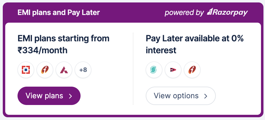
Handy Tips
- The default theme colour (blue) set on the widget will be considered if no colour is passed here.
- Only a 6-character HEX code is supported.
Add Parameter
Parameters
key mandatory
: string API Key ID generated from the Dashboard.
amount mandatory
: integer The amount to be paid by the customer in paise. For example, if the amount is ₹4000, enter 400000.
theme
: object Thematic options to modify the appearance of the header.
color optional
: string Enter the HEX code of your choice to change the appearance of the header.
3.2 Change Heading Colour and Font Size
You can customise the colour and font size of the headings on the widget. For example, if the colour of the heading is white and the font size is 12px you can change the colour to black and the font size to 14px.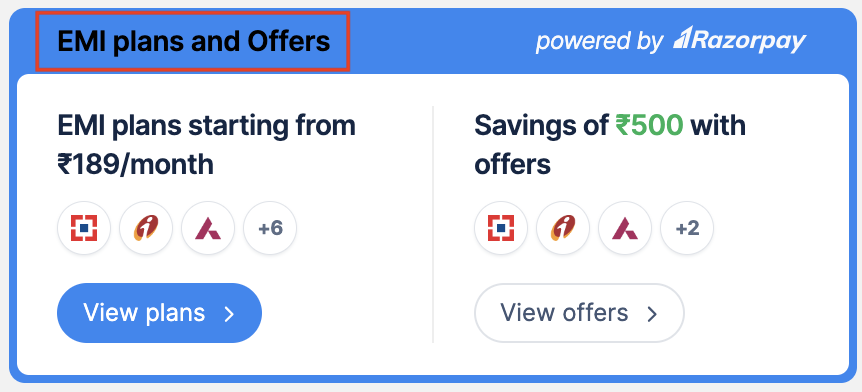
Handy TipsThe default colour (white) and font size set on the widget will be considered if nothing is passed here.
Add Parameter
Parameters
key mandatory
: string API Key ID generated from the Dashboard.
amount mandatory
: integer The amount to be paid by the customer in paise. For example, if the amount is ₹4000, enter 400000.
display.widget.main.heading
: object Customise the heading on the widget.
color optional
: string Enter the colour of your choice.
fontSize optional
: string Enter the font size of your choice.
3.3 Change Content Colour, Font Size and Background Colour
You can customise the colour and font size of the content on the widget. For example, if the colour of the content is black and the font size is 12px you can change the colour to blue and the font size to 13px. Additionally, you can also customise the background colour to match the look and feel of your website.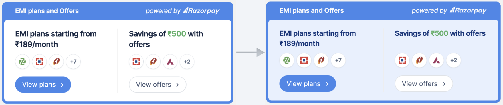
Handy TipsThe default colour (black), font size and background colour (white) set on the widget will be considered if nothing is passed here.
Add Parameter
Parameters
key mandatory
: string API Key ID generated from the Dashboard.
amount mandatory
: integer The amount to be paid by the customer in paise. For example, if the amount is ₹4000, enter 400000.
display.widget.main.content
: object Customise the content on the widget.
backgroundColor optional
: string Enter the background colour of your choice.
color optional
: string Enter the colour of your choice.
fontSize optional
: string Enter the font size of your choice.
3.4 Change Discount Value Colour
You can customise the colour of the discount value on the widget. For example, if the colour of the value is green, you can change the colour to pink.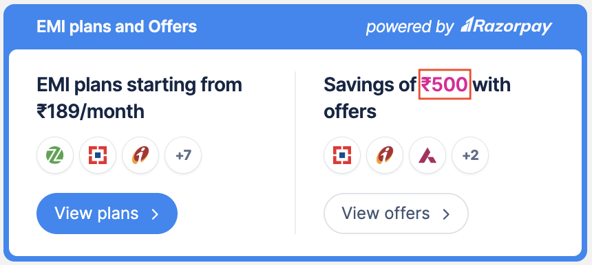
Handy TipsThe default colour (green) set on the widget will be considered if nothing is passed here.
Add Parameter
Parameters
key mandatory
: string API Key ID generated from the Dashboard.
amount mandatory
: integer The amount to be paid by the customer in paise. For example, if the amount is ₹4000, enter 400000.
display.widget.main.discount
: object Customise the discount value on the widget.
color optional
: string Enter the colour of your choice.
3.5 Change Button Appearance, Colour and Font Size
By default, a button appears on the widget to view the plans, offers and options. You can change the appearance of the button to a link based on your requirement. Additionally, you can customise the colour and font size of the link on the widget. For example, if the colour of the link is blue and the font size is 10px you can change the colour to black and the font size to 12px.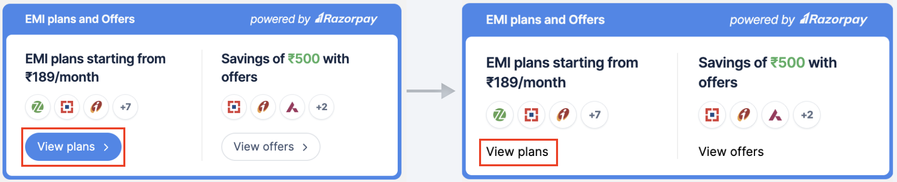
Handy TipsThe default colour (blue) and font size set on the widget will be considered if nothing is passed here.
Add Parameter
Parameters
key mandatory
: string API Key ID generated from the Dashboard.
amount mandatory
: integer The amount to be paid by the customer in paise. For example, if the amount is ₹4000, enter 400000.
display.widget.main.link
: object Customise the link on the widget.
button optional
: boolean Determine the presentation of EMI plans, offers, and Pay Later options. Possible values:
true(default): Display the EMI plans, offers and Pay Later options as buttons.false: Display the EMI plans, offers and Pay Later options as links.
color optional
: string Enter the colour of your choice.
fontSize optional
: string Enter the font size of your choice.
3.6 Change Footer Colour, Font Size and Logo
You can customise the colour and font size of the footer on the widget. For example, if the colour of the footer is white and the font size is 10px you can change the colour to black and the font size to 12px.Razorpay provides customisation option for the logo in two variants:
- Light (default)
- Dark
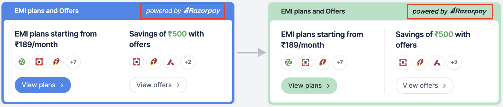
Handy TipsThe default colour, font size and Razorpay logo set on the widget will be considered if nothing is passed here.
Add Parameter
Parameters
key mandatory
: string API Key ID generated from the Dashboard.
amount mandatory
: integer The amount to be paid by the customer in paise. For example, if the amount is ₹4000, enter 400000.
display.widget.main.footer
: object Customise the footer of the widget.
color optional
: string Enter the colour of your choice.
fontSize optional
: string Enter the font size of your choice.
darklogo optional
: boolean Indicates the colour of the Razorpay logo. Possible values:
true: Display the Razorpay logo in a darker tone on the widget with a lighter theme colour.false(default): Display the default Razorpay logo on the widget with a darker theme colour.
3.7 Enable Dark Mode
Activate the widget’s dark mode when your website utilises dark mode. This is specifically designed for websites with darker background colors, improving the presentation of offers, plans, and options.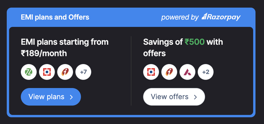 To enable dark mode:
Add Parameter
Parameters
key mandatory
: string API Key ID generated from the Dashboard.
amount mandatory
: integer The amount to be paid by the customer in paise. For example, if the amount is ₹4000, enter 400000.
display.widget.main
: object Customise dark mode on the widget.
isDarkMode optional
: boolean Specifies whether dark mode is enabled for the widget. Possible values:
true: Displays the widget in dark mode. (recommended for websites with darker background colors)false(default): Displays the widget in light mode.